
The inspiration for Mission is derrived from solar flares given off by the sun. The powerful, uplifting arcs are both fluid and stable.

Before going into Illustrator to build the letters, I sketched on 8.5" x 11" grid paper that had 1" units with 10 sub-units. This made the process of building them inside Illustrator MUCH easier and MUCH faster. Having the letters sketched out in pencil first also allowed for quick adjustments, making sure all of the letters appeared like they belong together.

Once the letters were built inside of Illustrator, I uploaded them into Type Tool 3. This was my first experience using Type Tool and man is it quirky! I enjoyed the challenge of learning a new program and am pleased with the results.
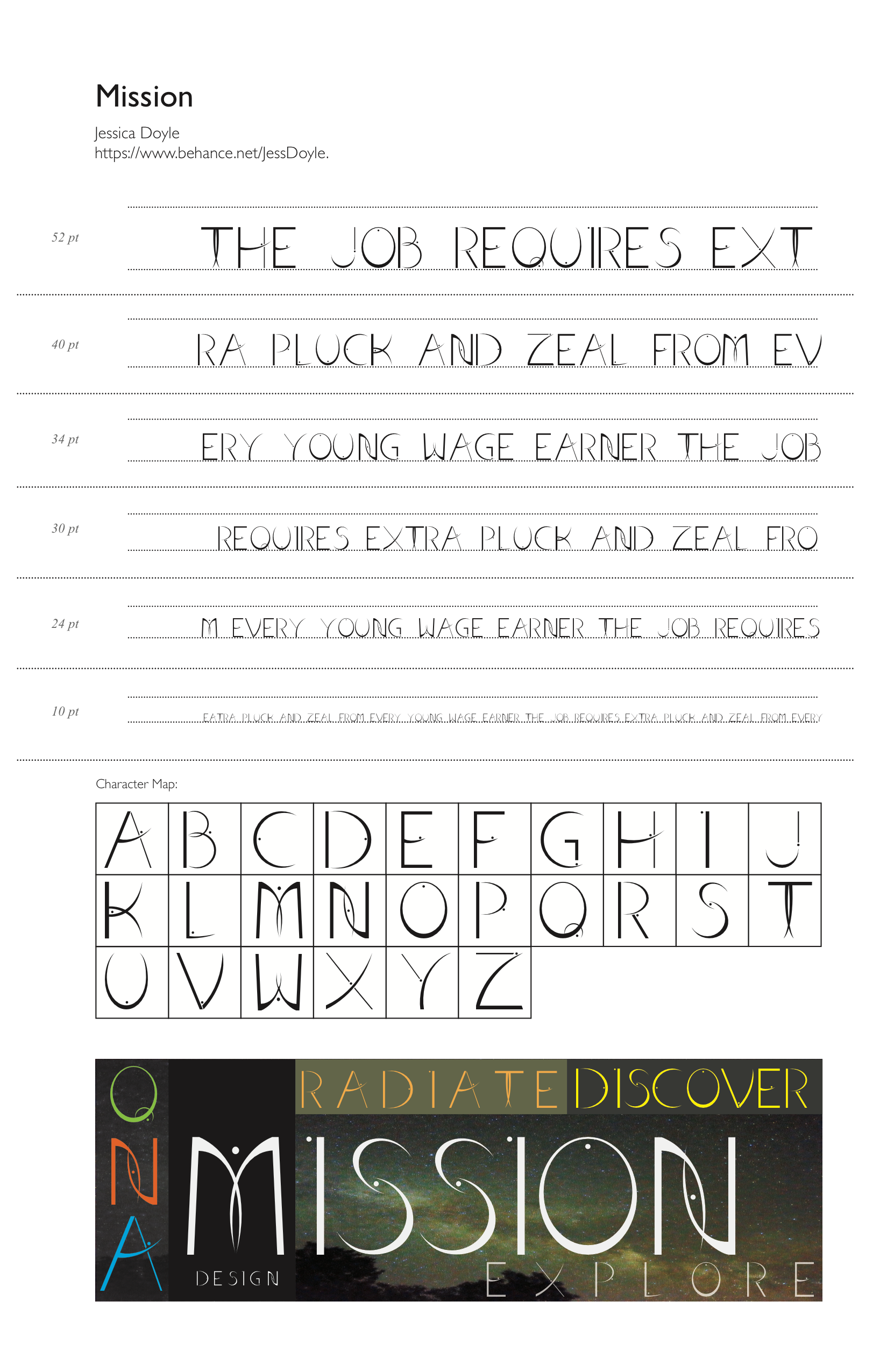
Type it out! I went through multiple pangrams to check the spacing of my letters. My typeface is not monospaced, but rather proportional. This spacing pairs well with the lively feel given by solar flares.

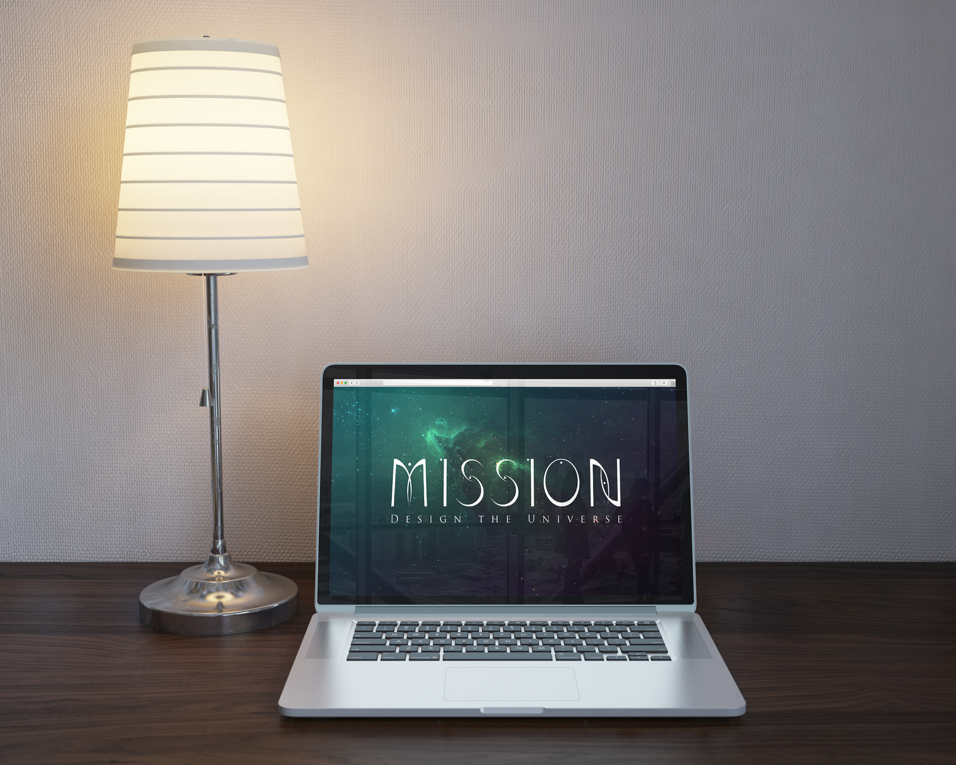
Digital Mock Ups are such a plus when designing for a potential client. You can say it will look good on something all you want, but no one is convinced until they see it! In design, seeing is believing.
Pairing typefaces is essential when mood boarding for any design where type is involved. Making sure that Mission was a typeface that played well with others was crucial in this project. Type can establish the mood and energy of a design, and if strong enough, it can stand on its own.