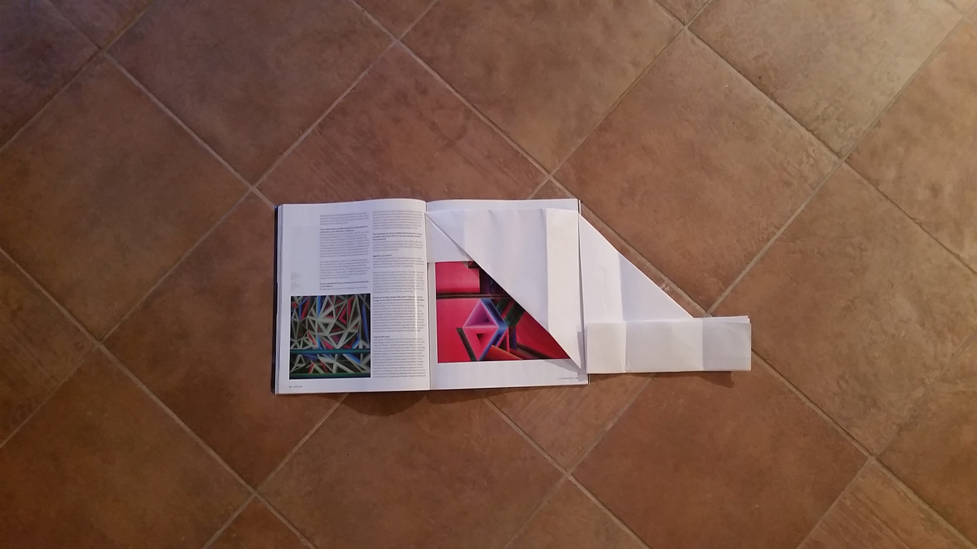
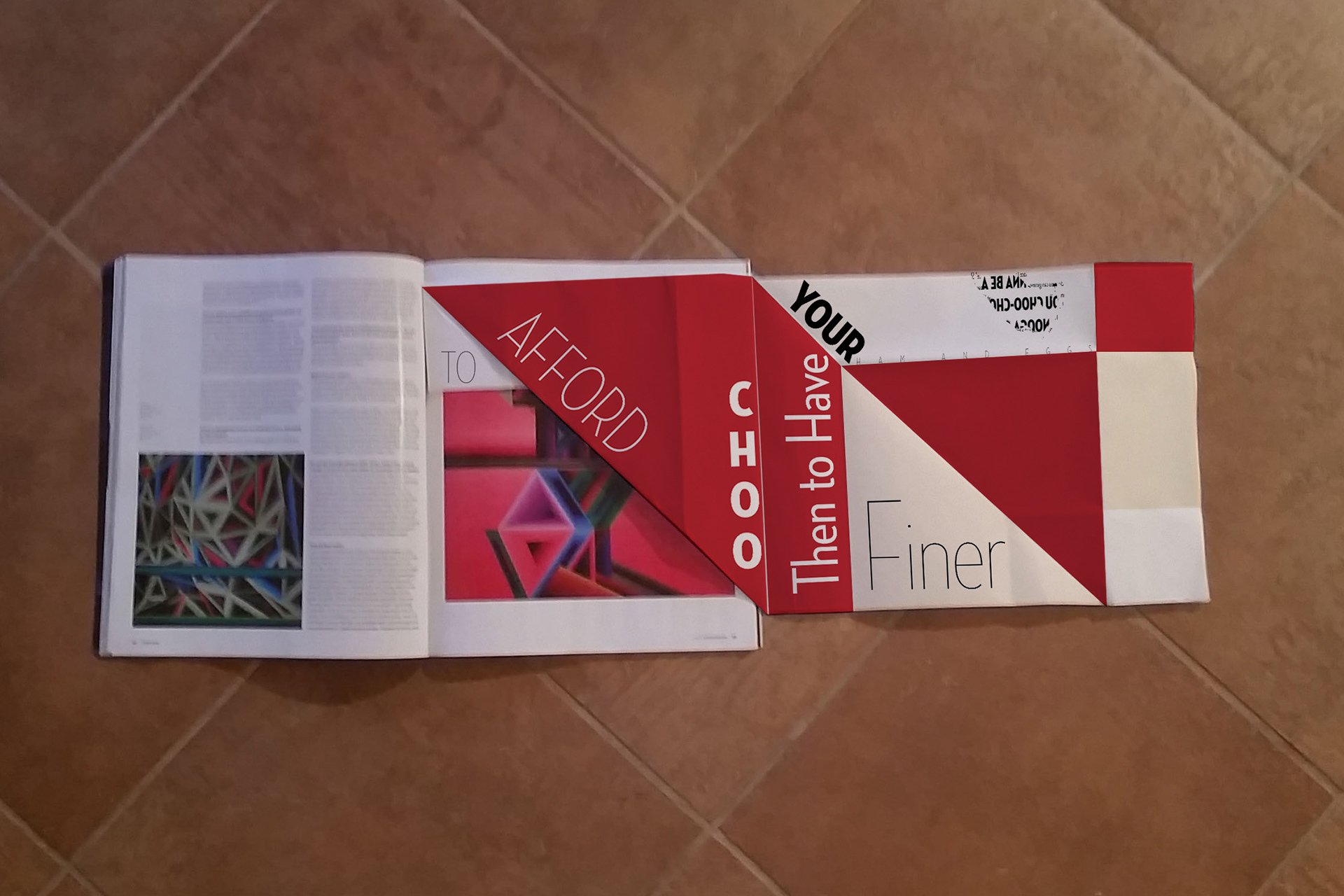
One of the challenges of this project is to fit a 24"x36" sheet of paper into a regular sized magazine comfortably. There has to be unfolded sides available to the spine of the magazine for binding purposes.

Folding the paper into a design that fits the magazine is tricky, and making sure the folds are not "predictable" is trickier still. The poster has to be visually engaging from the beginning.
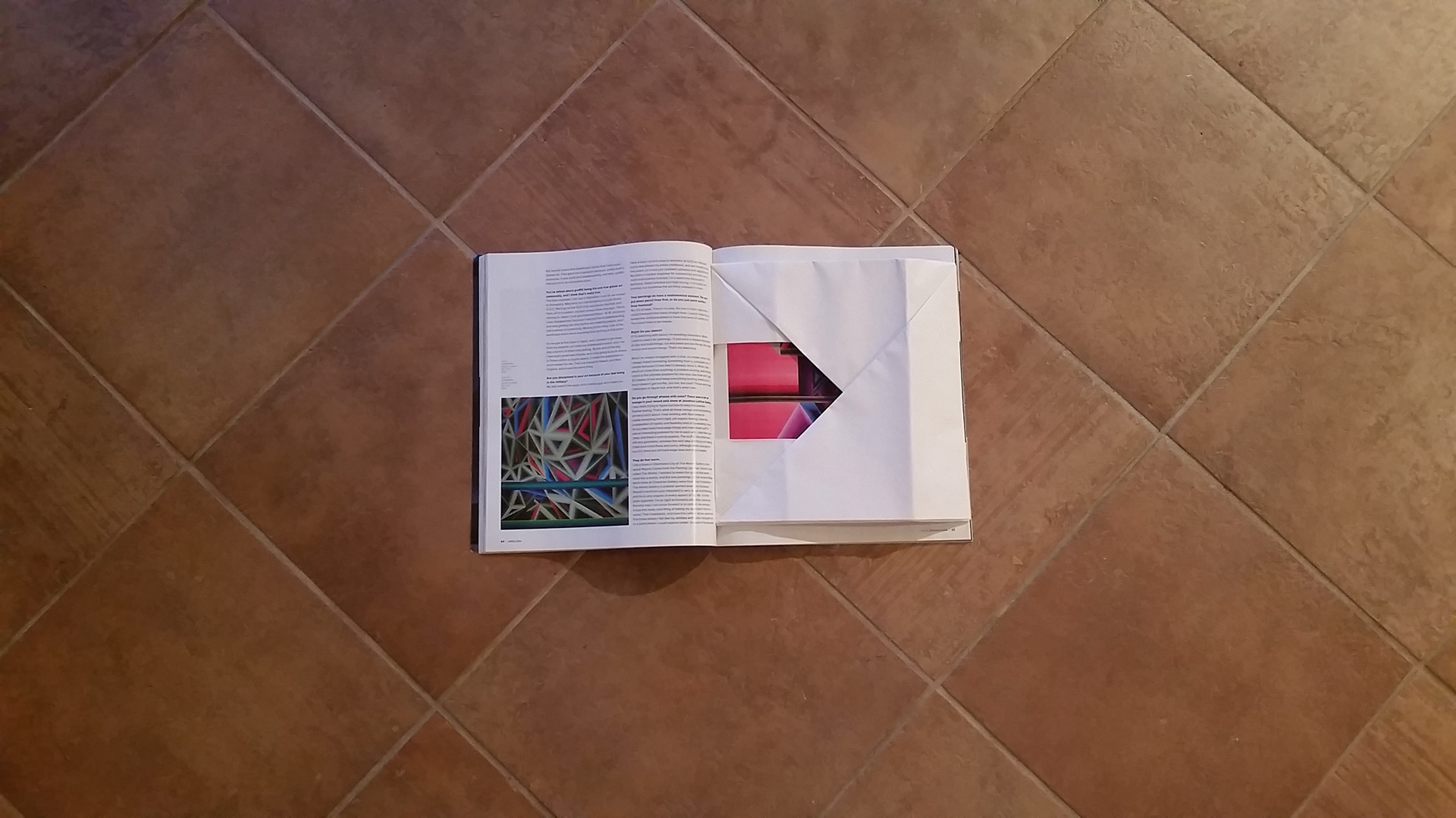
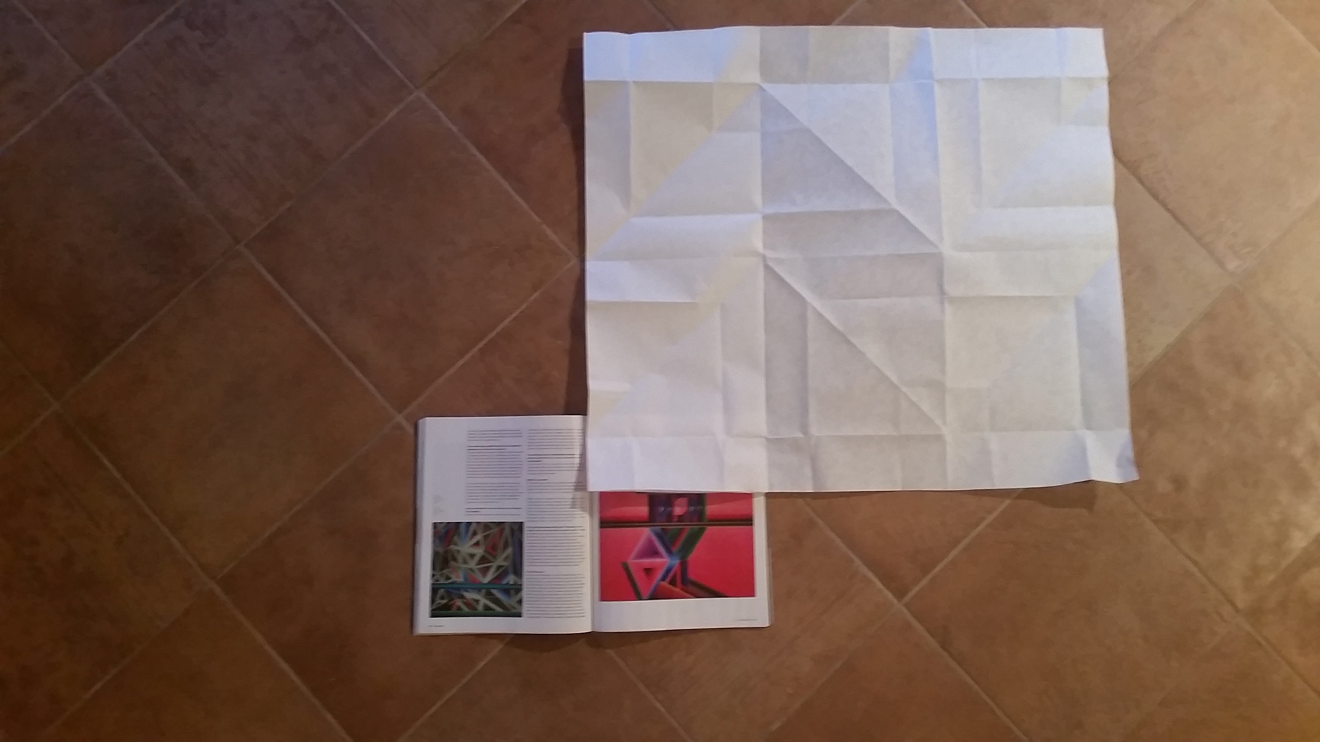
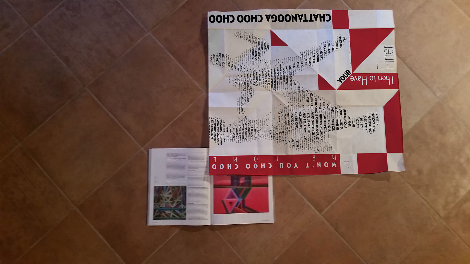
The folds must be easy to unfold and easy to fold back into original shape.
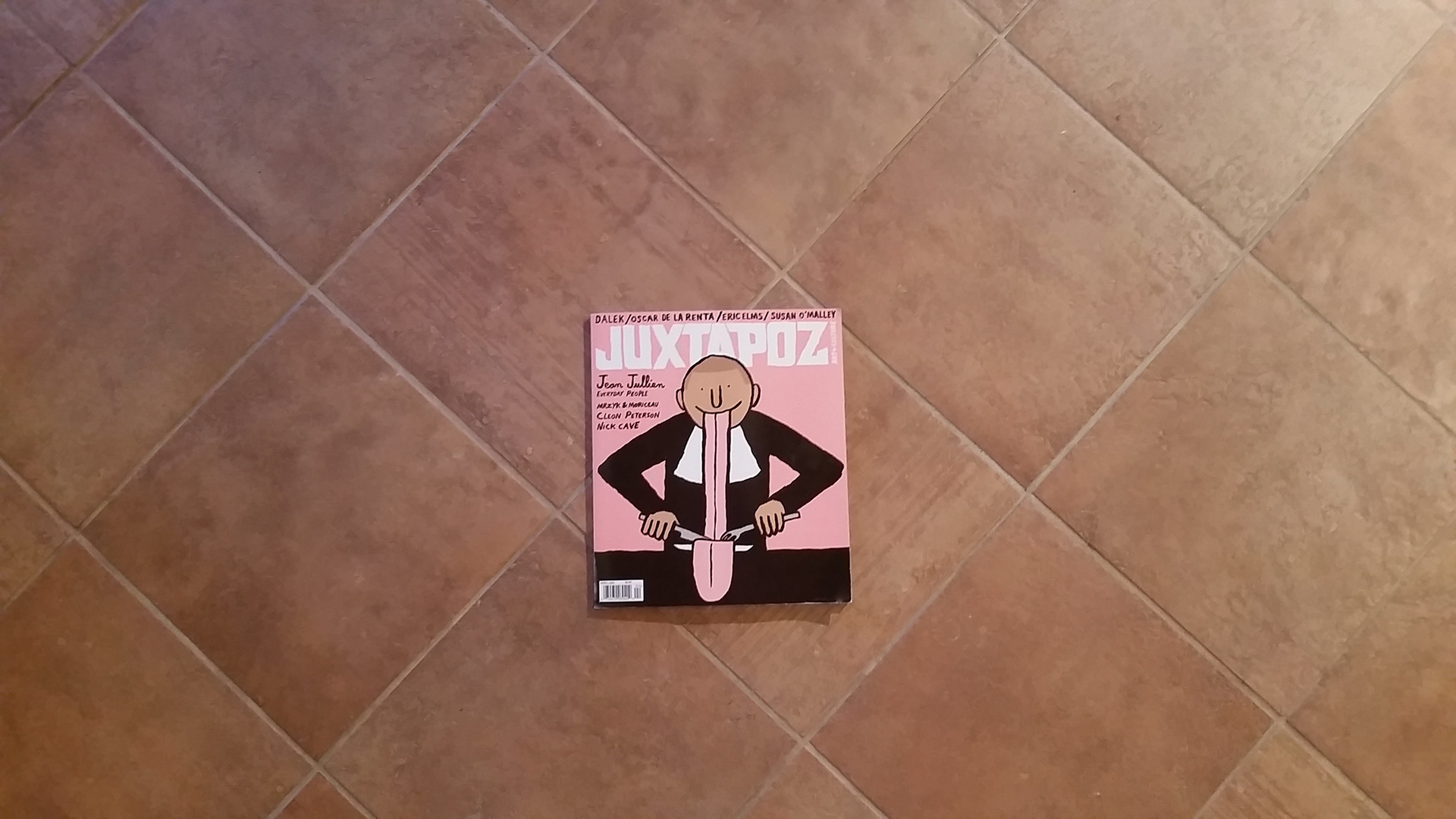
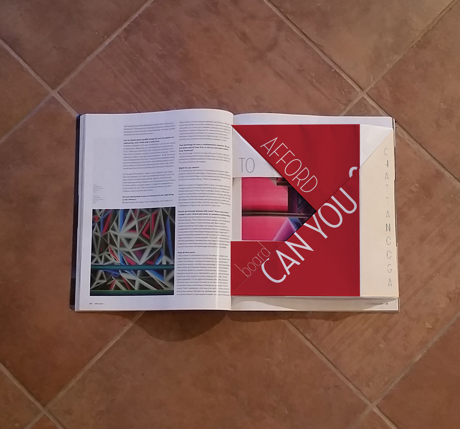
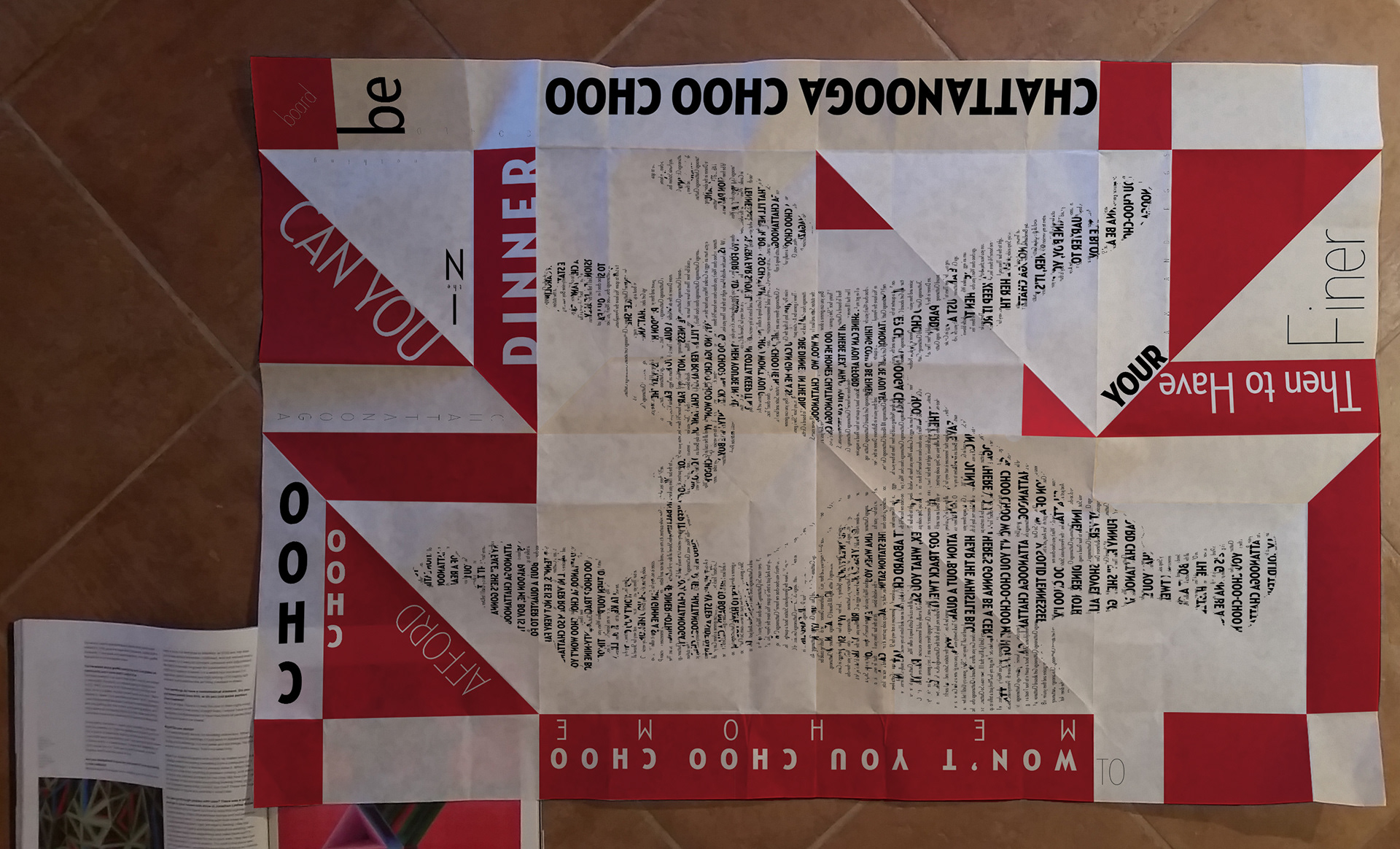
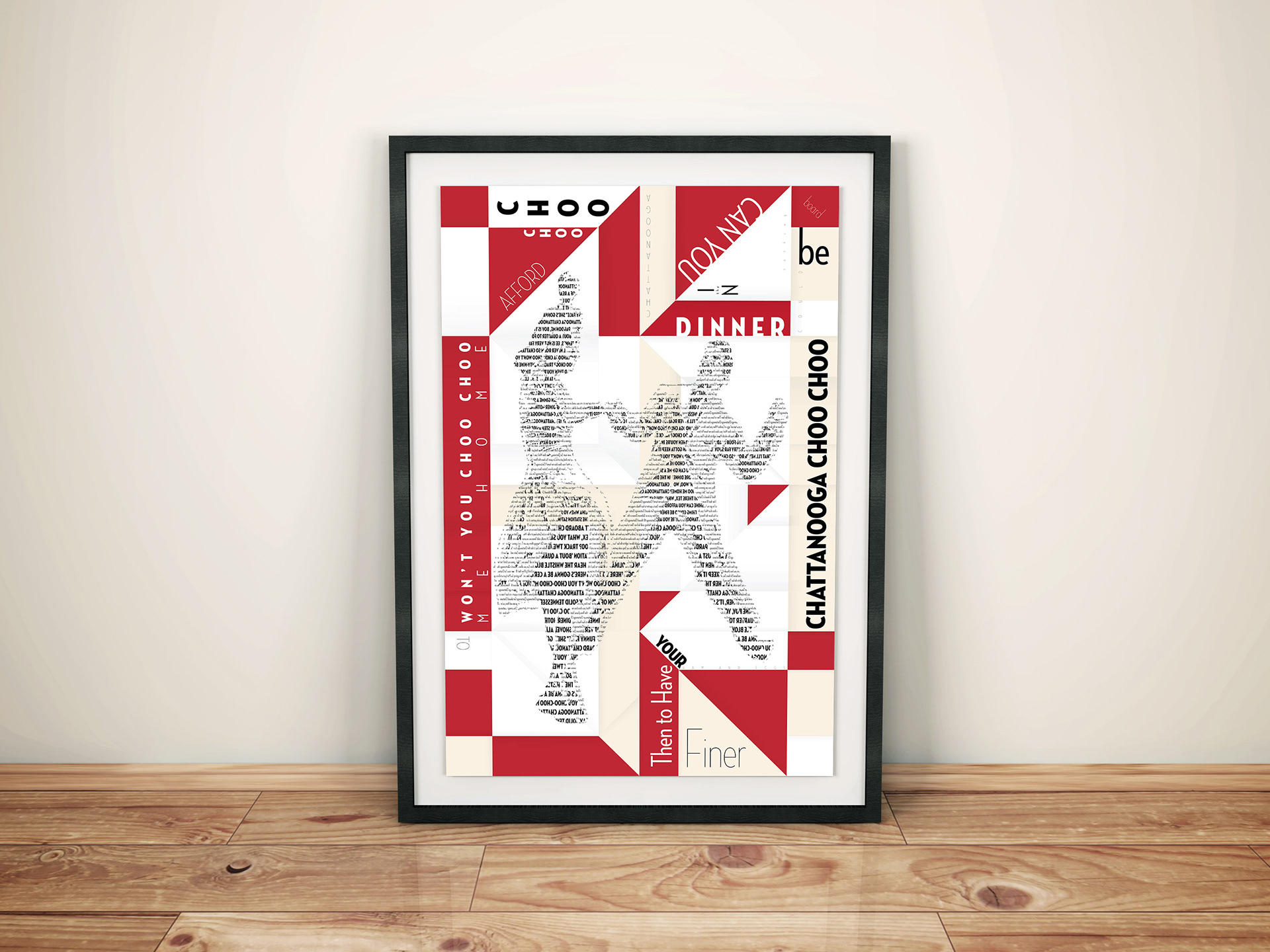
The assignment calls for a design magazine to hold our poster, and that poster will be featured in a "high end" kitchen. I was considerate of the tiling that is often featured as backsplashes in kitchens, playing off the diagonals.
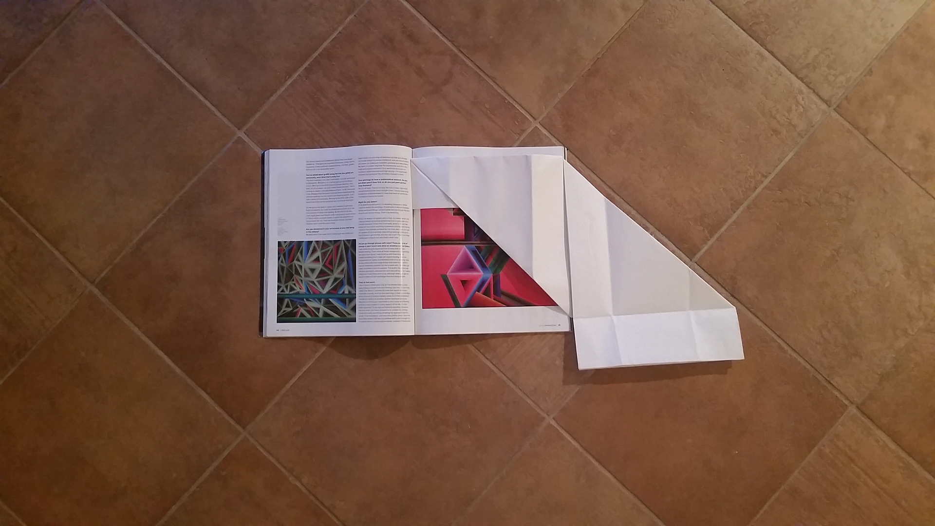


An important thing to note is how the poster opens away from the reader. Be considerate of how readers will be holding a magazine, think through the physical interaction.
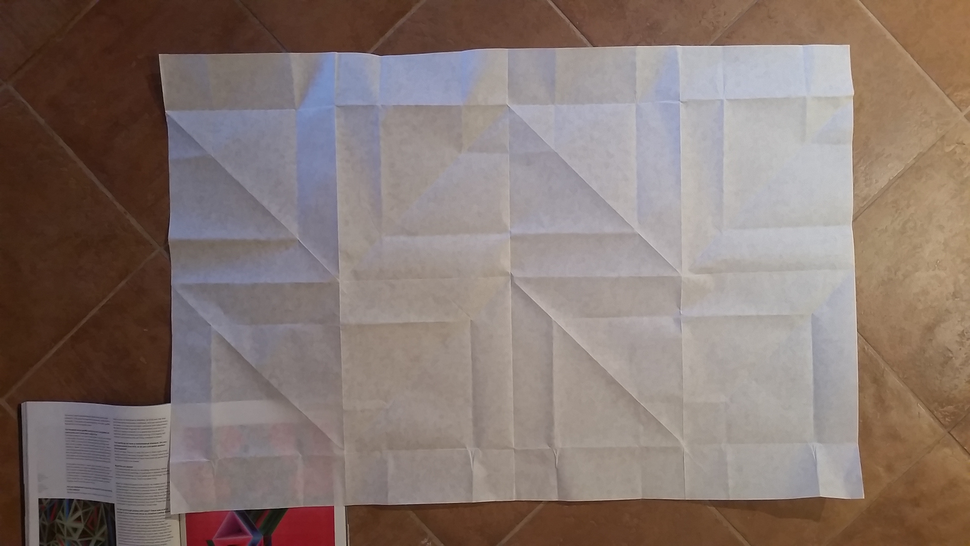
Measured out and precise folds will generate a grid. This grid will serve as the base for the poster design.

Now to start designing! In addition to the poster having to be something worthy of feature in a "high ed kitchen", it also must reflect a summer theme: summer love letters, road trips, ect. I decided to go for 1940s Summer.


Grid Making
Typography
College Project: To create a grid for a 24" x 36" poster that utilizes the fold lines as an element of the design. The folds must be visually engaging and easy for the viewer to interact with. Key points: the poster must be visually appealing enough to hang in a "high end kitchen", feature 101 summer recopies, and incorporate a summer design motif